Conventions of a Digipak
Front Panel - Artist name (bigger text than the title), album title, close-up of the artists face, parental advisory, capture the genre, direct appeal to the target audience.
Back Panel - Song titles, bar code, copyright information, information about the record label, website, continuing the theme of the front cover.
Spine - Name of artist, name of the album, record label, reference number, font/colour scheme continues the theme.
Interior Panels - Detailed credits, lyrics, continuing the theme of the rest of the album, a message, images of the artist or setting, CD tray has image behind it, spread an image across two panels on the inside.
CD Tray - Image of the artist or setting, continuing theme of the rest of the sides.
Below is a template of a Digipak


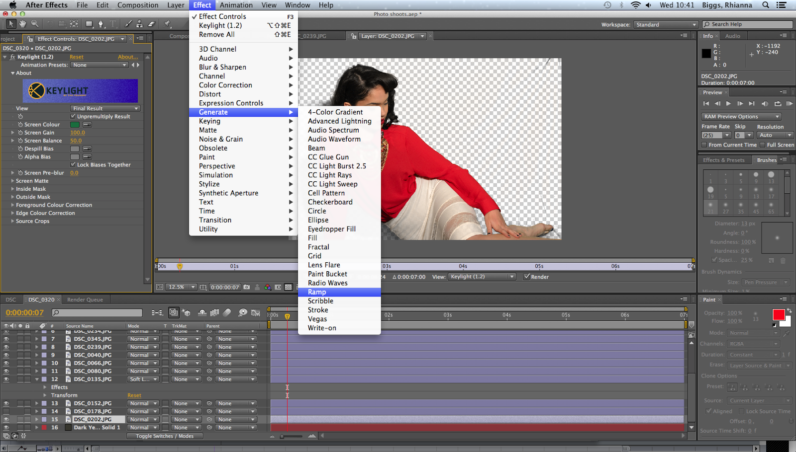
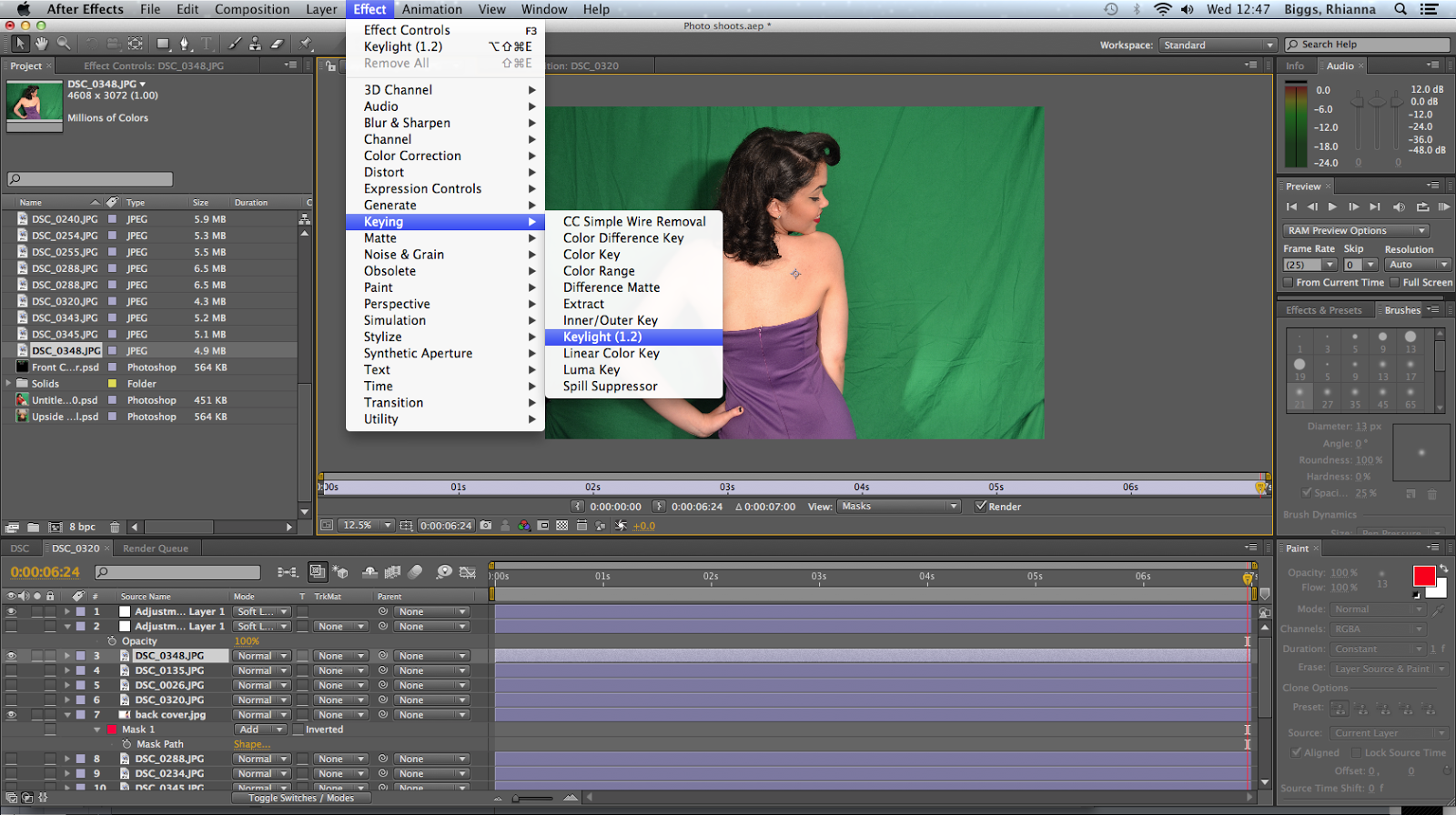


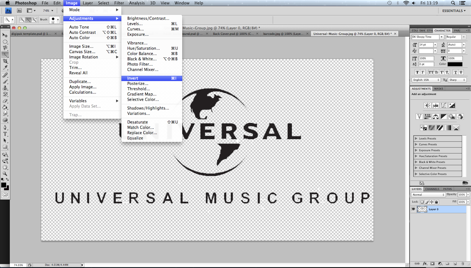 This is the logo for the record company that I have chosen to represent my artist. However, I had to edit it before I added it to my album cover and my poster as it was originally on a white background and I didn't feel it looked professional as my background was red and black so I had to use the Magic wand tool in Photoshop in order to remove the white background and make it transparent. After doing this I then had to use the adjustment tool and invert the writing to white instead of black so I could see the writing clearly on my poster and album cover.
 This is a screen shot taken mid-way of my editing process of my digipak. I've chosen to fragment my artists body by having one panel just be a close up of her face and another panel just showing her legs to illustrate the brokenness of my artist, this is also a theme that will feature in my music video as after researching similar artists, especially ones in the indie genre, they tend to write songs about vulnerability and the feeling of emptiness or loneliness so I thought it would be fitting to include this in my DigiPak.


